


Details Created on 09.10.2014 09:20
At first glance, it seems that the correct display on the shelf does not play a big role in the success of the final sale. However, as practice shows, the growth of its sales directly depends on the location of the goods in the hall. Put yourself in the place of a simple buyer. We ourselves often do not notice how goods appear in the basket that we did not plan to buy at all in the store. At the same time, we unconsciously buy products with a higher price or less familiar to us, but in beautiful packaging and with bright appeals, just for the sake of trying. This is due to the competent display of goods on the shelf. Let's talk about this topic in more detail.
The main principles of displaying goods on the shelf:
Product overview. As you know, they are greeted by clothes. Therefore, in order for the buyer to see your product, you need to turn the box with the front part towards the potential client. Remember, the task of each store is to ensure a quick sale of goods. In this regard, it is so important to increase the efficiency of each meter of retail space. Attracting the attention of consumers is carried out, among other things, with the help of the correct distribution of space on the shelves. It is known that the human eye perceives the product better if at least 3-5 packages of the same type are displayed next to it.
Availability. When forming the layout of the goods, it is important to know that " purchasing power The "consumer" is measured by the length of his arm. In this regard, light goods should be located on the upper shelves, and heavy - on the lower ones. This principle of arrangement also allows you to reduce the number of damage and breakage of goods on the trading floor.
Corresponding type of "front row" goods. In merchandising, there is such a thing as "front row". The number of products presented in it depends on the volume of their packaging, as well as on the demand for these products and the ability to quickly replenish the shelf stock. To speed up the turnover, it is important to constantly maintain the amount of goods set for the "front row". Therefore, during the day, you should fill the first row on the shelf with goods several times.
Cleanliness. Shelves, as well as display units, must be kept clean on a regular basis. If the packaging of your product is damaged, looks unattractive to the buyer, you must quickly remove such a copy from the shelves and discount it to speed up the subsequent sale.
Shelf load. Merchandising, first of all, should take care of the convenience of the buyer. In a large store, a person is forced to scan from 30 to 40 types of goods from the huge assortment offered by the store in less than half an hour. Often the absence desired product on the shelf causes irritation and dissatisfaction in the buyer. If this situation is repeated regularly, the visitor stops going to this store. Maximum revolutions can only be made when the shelf space is completely filled. Shelf goods must be shown in a winning way; there should be free space around it so that it can be better studied and considered.
The well-known axiom: “full shelves sell out better” is well applicable to large shopping centers. However, this rule does not always work for small boutiques.
Buyer facing rule. When placing the product on the shelf, consider the angle of view of a potential buyer. It is important that the basic information about the product on the packaging is easy to read and not obscured by price tags or packaging of other products. Unfortunately, in small retail outlets, the “face to the buyer” rule is often violated. There is simply not enough space in them, but on the contrary, there is a lot of goods.
Poorly placed goods on the shelf can only be found if the following conditions are met:
The buyer wants to purchase this particular product;
the buyer has already clearly formed an idea about a particular brand;
he knows what the package should look like;
the buyer has enough time to find the right product;
he has the opportunity to ask the seller a question.
An example of a poorly placed product is when the package is partially or completely covered by the price tag. Remember, the price tag cannot replace the information on the product packaging. The price tag has standard view, and the packaging emphasizes the individuality of the product, and also contains much more information that is important for the consumer. The packaging was created by professional designers and marketers, who made it the bearer of a certain idea and image. Therefore, if the price tag covers most of the packaging, place similar products side by side so that they, in turn, are fully visible.
In order for a product to be more likely to be noticed, it must also have sufficient "facing" (a certain number of products in the same package (SKU) displayed on the shelf). Facing - a unit of goods, installed facing the buyer. This task is not always easy to solve under the conditions of established planograms within the store or the network as a whole.
Rules for exhibiting goods:
Cheap ahead. Each store has its own positioning: discounters, premium stores, mixed-matrix stores. The overall impression of the price level of the store is influenced by inexpensive goods. If they are placed at the beginning of the trading floor, then unconsciously the buyer is drawn into the shopping process and then takes the goods already “automatically”, paying less attention to prices. At the same time, in a premium store, it is necessary to display goods in the price range corresponding to this segment. For example, shelves with delicacies. The buyer must clearly understand where he got and whether he expects.
The principle of striping. According to this principle, goods of a low price category alternate with goods that bring the highest profit to the store. This alternation is carried out in the direction of the buyer's movement on the trading floor. At the same time, an expensive product that provides the highest margin should not be installed at the end of the route. After all, having reached it, the buyer can already fill his basket to capacity. If this product is as attractive as possible for him, he may decide to purchase, but he will purchase, for example, not six packs, but will limit himself to one or two.
Main brands. Key brands should be placed at the beginning of each product line. According to the laws of psychology, a person will put more goods into an empty basket. This is important to take into account.
priority shelves. When deciding which product should be at the level of the consumer's eyes, be guided by the following principle: the product that brings the greatest profit should be located in a more advantageous place. As a rule, such positions are used to place goods that are dedicated to trade marketing events held in the store (all kinds of promotions, tastings, etc.).
Bottom shelves. Here they place products / goods that are bought not IMPULSIVELY, but consciously. The consumer will find this product anyway, because he came for it.
Top shelves. It is advisable to use the upper shelves to create the image of a commodity producer. For this, an alternative layout is used (addition of the layout of the main product with cross groups), as well as the layout of the most expensive items in unusually designed packages.
Rotation of goods. The closer to the end of the expiration date of the product, the closer to the consumer it should be placed on the shelf. When replenishing the stock on the trading floor, the goods received from the warehouse should be placed back, and the goods already on the shelf should be moved forward. In this case, it is necessary to regularly check the expiration dates.
Shelf height. It is important that the height of the shelf matches the height of the product being sold. If you can stick two fingers between the top edge of the product and the next shelf, you need to change the distance between the shelves. On the saved space, it will be possible to place another shelf.
Products with technical features
In the assortment of goods with complex technical features, the display does not play the most important role, since the buyer needs special advice from a sales assistant. In this case, the eye level rule, layout, etc. play a lesser role for the buyer. At the same time, no one canceled the rule when the exhibition sample must be in a presentable form. When selling technically complex goods, the competence of the seller himself is very important, and only then the layout and appearance. For example, in products: large household appliances, small household appliances, televisions, computers, telephones, building and finishing materials, furniture, etc.
It is important for the buyer to understand how the product fits the required parameters, dimensions, characteristics, technical features, interior, etc. It is important to understand how products differ by brand, what are the differences between products in different price categories, where are the pros and cons. Here, the purchase is made absolutely consciously, often after consultation, the buyer needs time to make a decision. The result of the sale depends on how professionally the seller can conduct consultations, how motivated he is for a particular brand. Professionally provided advice can lead the buyer from a well-known brand to a little-known one. Therefore, in stores selling household appliances, there are always a lot of professional consultants. At the same time, many brands provide their own employees focused on selling their products.
You must register to add a comment.
Exist general posting rules, which reflect the peculiarities of a person's perception of a group of goods laid out side by side on the same rack or other commercial equipment.
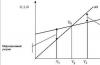
1. During the inspection of goods, laid out on racks, the buyer's gaze moves from left to right and from top to bottom (as when reading a text). Most types of display of goods are based on these features of the movement of the eyes of the buyer.
2. Eye level and arm outstretched level. The greatest concentration of human attention falls on objects located at eye level, that is, in a zone of about 20 cm from the eye level of an adult of average height. Another attractive place to place goods is at arm's length (in this case, the average growth of the store's target audience should be taken into account) (Fig. 23).
Rice. 23. "Golden" shelves, taking into account the growth of the buyer and the distribution of sales between the shelves of commercial equipment
So, by moving the goods within the shelves of the rack, you can significantly influence its sales volumes (Fig. 24).

Rice. 24. in
Everything that a person standing motionless sees around him is called the visual field. Objects in the lower part of the visual field are often left unattended. At the same time, the lower left corner is the most unfortunate for placing goods - this is the so-called "dead zone" (Fig. 25).

Rice. 25. in
In order to attract the attention of the buyer to the bottom shelf, goods of targeted demand are placed on it (sugar, groceries of a low price segment, etc.), large-sized goods (containers of 3, 5 and 10 liters, packaged goods weighing more than 3 kg, etc.), inventory(if it is stored on the trading floor). This layout principle is called "tectonic" and provides that large and heavy goods are placed at the bottom, and light and small in size - on the upper shelves of commercial equipment (Fig. 26).

Rice. 26. "Tectonic" principle of placing goods on shelves
It has also been established that a product laid out above eye level is perceived by the buyer as a product of a high price category, respectively, below eye level - a lower price category. This pattern has its own logical explanation: impulsive purchases are made mainly by wealthy consumers. Therefore, such goods should be placed in the most visually accessible places. Therefore, it is on the top shelves that goods of a high price segment, goods in gift wrapping and other cost related goods are often laid out.
In the process of various studies, a pattern was established for the buyer's reaction to the movement of goods within the shelves of commercial equipment:

3. Priority places on the shelves. Shelf space is not homogeneous in terms of its contribution to the sale of goods that are displayed on the shelves of commercial equipment. The "quality" of a shelf primarily depends on the direction of buyers' movement.

Rice. 27. in The influence of the direction of movement of buyers in the trading floor on the sales volumes of impulsive goods
The most attractive is the place on the rack, which is located at the beginning of the movement of buyers, the least attractive are the places on the racks in the "dead zone", as well as the lower and upper shelves of commercial equipment (Fig. 28).

Rice. 28. in
The zone within which a person sees the product, evaluates it and makes decisions regarding the purchase is approximately 50 cm. Therefore, the width of the product display must be at least 40 cm so that it stands out among other products of the same product category.
The distribution of buyers' attention also depends on the length of the shelves of commercial equipment: the longer the shelf, the more difficult it is for the buyer to concentrate his attention on individual items, the more difficult it is to highlight the best product. Therefore, experts do not recommend using a horizontal display of one product with a length of more than 1.5 m.
4. The law of "figure and background". The essence of this law is that a person always singles out one object from the environment, while other objects that are nearby become its background for a certain time (Fig. 29).

Rice. 29. in An example of the implementation of the law of "figure and background"
This law is used in merchandising in cases where it is necessary to focus the buyer's attention on a particular product in order to enhance its sales.
The selection of the figure against the background is achieved by:
Quantity or size (for example, the quantity of one product on the shelves is greater than the other, or one product is larger in size than the other) (Fig. 30);
Bright colors (red, orange, yellow, etc.) - goods with bright packaging often become a figure rather than a background;
Non-standard form of goods or packaging - the buyer first of all pays attention to everything new and non-standard in shape, color and packaging (the effect of novelty is triggered);
Product highlights are used in the process of trading in goods that the buyer needs to inspect well (for example, watches, jewelry, clothes, etc.);
POS-materials - well-placed POS-materials are designed to draw the attention of the buyer to a particular product and distinguish it from others;
Creating an emotional image (a combination of merchandising and design) - an example is the principle of total look in the presentation of a product (for example, creating a complete image from clothing and accessories).

Rice. 30. in
5. Law "Switching Attention" - along with the selection of the figure, the buyer requires a switch of attention, that is, the search and selection of a new figure against the background (Fig. 31). This means that you can not lay out the same type of product in one long line without visual accents. Such visual accents are POS-materials (vertical delimiters, shelftalkers with the brand name, etc.).

Rice. 31. in Examples of the implementation of the law "switching attention"
6. Perception of shapes and volume, composition in the display of goods. Depending on the use of shelf space, the composition is divided into the following types: planar composition (formed in one plane) - the use of height and width in the composition, subject to the minimum use of volume and depth; three-dimensional composition - the use of height, width and depth; spatial composition - the use of height, width, depth, with the dominance of depth.
A composition with the largest or smallest element in its center is often called a "major" or "minor" layout (Fig. 32).

Rice. 32. in Arrangement of goods according to the "Minor" scheme
The rhythm in the layout is a certain repetition of goods of a similar size and other elements (price tags) with an equal distance between them. Rhythm helps create a sense of order. But in the absence of accents, such a layout will not be able to interest buyers.
7. Law of "Group" are used in order for the buyer to navigate in the presented assortment of goods, it is easier for him to perceive the goods if they are grouped in a certain way. So, the goods should be combined into groups according to certain characteristics (for example, by brand, by type of product, by package size / weight, etc.) (Fig. 33).

Rice. 33. in An example of the implementation of the law of "grouping"
8. Law "7 ± 2". Psychologists say that the volume of human perception is limited - at a certain point in time, he can remember five - seven, maximum ten items. In the store, this number of items is reduced to 3-5 (Fig. 34). Therefore, experts recommend presenting no more than five items of goods, brands or POS materials on one shelf (showcase), in one row (for example, no more than five types of cameras from one manufacturer on a shelf).

Rice. 34. in An example of the implementation of the law "7 ± 2"
9. Laws of visual perception of color. Color, its saturation, shades, combinations - all this significantly affects the emotional state of a person. Bright saturated colors and shades attract attention faster than calm ones. Light shades are more attractive than dark ones. But it should be borne in mind that a person's perception of color and attitude towards them depend on what function the color and the material object in front of it performs (using the same color scheme in interior design, creating an advertisement, choosing branded clothing, or when focusing attention on products). does not always provide a positive result).
10. Customer perception of the lighting system in the store. The organization of the lighting system is an important component in the merchandising system in the store, it must correspond to the general concept of the store, its design, interior and the specifics of the goods presented. Successful lighting contributes to the growth of sales of even in-demand consumer goods. Buyers fix their eyes on those items that are well lit.
For different groups of goods, there are recommendations for organizing lighting in order to create comfortable conditions for buyers, as well as optimal display of goods. For example: bread, pastries, cakes - warm golden shades of light; dairy products, frozen goods, fish - cold shades of light; meat products - neutral white light, high degree of color rendering; flowers, vegetables, fruits - a high degree of color rendering, lighting is close to the spectrum of sunlight; jewelry - accent lighting, the use of different shades for different metals and stones; children's goods, toys - warm shades of light.
11. "Facing the buyer." The product should always be located with the label or face to the buyer, taking into account his angle of view. The information on the packaging should be easy to read without significant physical effort, not overlapped by other packaging or price tags. It should be borne in mind that a person can easily read a vertically written word if it consists of no more than five letters and is common (there are no more than 100 such words). The buyer will not read long and foreign words written vertically. It is also necessary to ensure that price tags and POS materials do not cover the goods presented on the relevant commercial equipment.
12. Ensuring the required number of faces. Facing (from the English face - face) - this is a unit of production that is visible (in self-service stores - available) to the consumer. Facing performs two functions: demonstration and retention of shelf space (Fig. 35). Depending on the tasks set by the manufacturer, one of the functions dominates.

Rice. 35. in
Facing plays the role of a conventional unit for measuring the area of shelves. Thus, each assortment position can take several faces at the point of sale. In the practice of merchandising there is a rule space to sale, which determines that a product brand, a brand should occupy such a percentage of shelf space as it occupies in sales of all goods (or profits) exhibited in a certain area.
But it is necessary to distinguish between the concepts of "facing" and "product stock on the shelf" for each commodity item.
Related to the concept of "facing" is setting a goal for shelf space (SKU), which involves determining the number of facings that the manufacturer wants to present at the point of sale.
One of the reasons to set shelf space goals is to optimize the turnover rate in order to ensure an even vanishing of goods from the point of sale and a close to 100% probability that each customer will leave with a purchase. Another reason is to increase the visual perception of goods at the point of sale. In this case, facing performs a demonstration function.
13. Trade equipment must be clean, free of dust and stains. The shelves on the racks should be placed so that 3-4 cm remain from the edge of the goods to the edge of the top shelf - the so-called "rule of two fingers" (Fig. 36). If the interval is longer, then the shelf space is used inefficiently, if it is less, the selection of goods from the shelf becomes more difficult for the buyer.

Hello! Periodic studies of marketers show that the correct and rational display of goods in a store or trading floor directly affects the level of sales. She helps create point of sale optimal comfortable conditions for the buyer, makes it easier for him to choose the necessary products. In fact, the display of goods on the trading floor is various ways and tools to demonstrate them to customers. We will introduce you to the intricacies in this article.
Goals and objectives of rational calculation
The main goal of displaying goods in a certain way is not to create a spectacular picture, but to control the behavior and desires of potential buyers. Do not confuse placement and display of goods. In the first case, this refers to the distribution of products on the trading floor, and in the second, the search for the most profitable and convenient place on the trading equipment.
Rational placement and display of goods on the trading floor of the store should solve certain problems:
- To create ideal conditions that help to present products in the most profitable way;
- Determine the level of visual review for the buyer, direct his attention in the right direction;
- Increase the attractiveness of goods of impulse demand;
- Create conditions that highlight some units in the eyes of the buyer;
- Make the shopping process convenient and enjoyable.
Together, the solution of all these problems helps to present the seller in a more advantageous light and distinguish them from competitors. Statistics show that in stores that adhere to the rules of merchandising, sales volumes are higher and more stable.
Calculation principles
When placing goods on racks or shelves, a specialist must follow certain rules or principles:
- Adequacy. It assumes that the largest assortment should be presented on the windows.
- Consistency. Products should be divided into groups - juices will stand with groceries, and kefir with dairy products.
- visibility. Customers like to look at the product, so it should be available on the shelves.
- Efficiency. Every free centimeter should “work and earn” in the store. Therefore, it is necessary to rationally arrange commercial equipment and furniture.
At the heart of all principles is the desire to simplify the search for the right product, to facilitate the process of making purchases. This will help to return a person to the store, turn into a regular customer.
Ways of displaying goods
The principles of displaying goods must be observed in outlets of any type. They are the same for hypermarkets and small convenience stores.
Before and, it is necessary to understand the main types of product location on commercial equipment:
- Vertical or horizontal shelf placement. The former gives buyers the widest view and promotes good sales. With a horizontal one, you can systematize goods, arrange them by price level or brands. Most stores use mixed view arrangements. With vertical placement, the highest quality and most expensive goods are usually placed at eye level, and the cheapest - on the lower shelves.
- Corporate. All products of the same brand are placed on one rack or shelf, creating a bright recognizable block. This type of display is used if the brand occupies at least 5% of all store stocks. It is based on the principle of a color spot, which attracts increased attention with the help of contrast.
- Display placement. In this case, the goods are installed on a vertical stand in a conspicuous place: in the center of the hall or not far from the entrance. Often this arrangement is used at small branded outlets, trying to present the goods to customers as fully as possible.
- Floor arrangement. This type is used quite rarely when there is a shortage of commercial furniture or equipment. It is good for bulky goods and completely unsuitable for small ones: customers are unlikely to like to bend over a small box to examine its contents.
Recently, large hypermarkets are increasingly practicing bulk display: products in packaging are displayed in special metal containers without packaging by type or brand. Usually it comes at the same price with a discount, and buyers can safely choose and view products.
Any chosen option should provide the product with the attention of buyers, the complete safety of the packaging and all qualities.
Basic rules for displaying goods
Marketing takes seriously the study and compilation of product display technology. It is based on research by well-known experts and the psychological characteristics of customer behavior.
The most commonly applied rules are:
- "Face to face". Goods must be placed on the shelves so that the buyer can see them from any angle and can read all the information. To attract attention, you can put several identical bright packages together. A recognizable wrapper or box is obtained through special experiments with the tastes of consumers, their color and visual preferences.
- "Basic Brands". The rule says that it is better to place the brands necessary for a potential buyer at the beginning of the shelves in front of other similar groups of goods. Psychology says that the buyer will put more goods of the main brands in his empty basket.
- "Shelves in priority." When laying out goods on commercial equipment, the most popular and profitable products for the store should be placed at eye level. This rule also applies to promotional goods, which should “strike” the eye and attract more attention.
- The rule of "lower shelves". They place products that buyers purchase without fail and without additional advertising: large economy packages, little things for the household.
- Top shelf rule. More expensive and fashionable products are laid out on them, which need to attract attention for an early sale.
- "By package size" The rule requires placing small packages to the left of the buyer, and large ones to the right.
- Location "among competitors". Good way increase sales - place a batch of a newer product among a well-established competitor.
A good marketer checks the distance between shelves and stands, adjusts them for the convenience of customers. For him, the surrounding picture and the direction of the light in the hall matter.
For a logically correct placement, a specialist has to take into account several factors:
- The frequency of buying a particular product;
- Dimensions and weight;
- Number of varieties or species;
- The time it takes to inspect a product, label, or instructions.
The correct layout even depends on the routes of customers through the store, the width of the shelves and the image of the entire outlet.
The main stages of the calculation
In the vast majority of cases, buyers make a decision on choosing a product while standing at the counter. In order to imperceptibly correct their actions and persuade them to buy, marketers use different display features.
When working on the placement of goods in any store or supermarket, it goes through three important stages:
- Organizational. Goods occupy certain places on the shelves or in the hall, which must be kept in order. Many customers get used to a particular place and purposefully go to the store for their favorite juice or sweets. And placing the necessary accessories (dishes, spare parts or spices) next to the main group encourages unplanned purchases.
- Managed. At this stage, it is necessary to evaluate the rationality of each trading place, to calculate what financial return it brings to the store. It is better to put high-demand goods in the most prominent place, to draw additional attention to new positions.
- Seductive. At this stage, it is necessary to analyze the dynamics of the development of the entire store. The layout should attract, seduce and encourage purchases. This is especially true for the time of discounts and promotions, for which goods are placed taking into account offers that are beneficial to buyers.
The goods should not be presented randomly (which is a sin of small stores), but in accordance with a special scheme. This is a reasonable planogram of the product, which is drawn up in the form of a drawing on a computer or by hand. It should contain the exact placement of each product in the hall, the quantity on the shelves or pallets. Such a planogram must be approved by the head of the store, and the sellers adhere to it in their work.
All technology of displaying goods should be aimed at the convenience of the buyer. It should reduce the search for the desired product and unobtrusively offer new products.
Most simple rules help you do it quickly and easily:
- Goods should not affect each other, so they do not have household chemicals and food nearby;
- It is better to place large and dimensional products closer to the entrance so that they do not block the view;
- Seasonal novelties and goods with a good discount are best placed in the most prominent place;
- The buyer needs to give the effect of accessibility, so open shelving and self-service shelves are very popular;
- For a profitable presentation of goods, you should not save on equipment for trade, purchase only modern and high-quality refrigerated display cases, stands and mannequins;
- Price tags must be read, and samplers may be offered for some non-food items.
It is not enough to make a calculation once: the marketer constantly analyzes all the options, their impact on the level of sales. This makes it possible to choose the most profitable positions and constantly raise the income of the outlet.
Online merchandising rules
Despite the lack of conventional shelves, a rational approach to the placement of goods helps to increase website views, the number of returns and purchases online. The more convenient and original the product is presented, the more buyers recommend it to their friends, return for new purchases. Moreover, modern computer technologies make it possible to make bright and stylish presentations that attract attention.
The main rule when displaying goods in an online store is to provide a potential buyer with as much information as possible about the properties, colors or possible discounts.
You can use many marketing techniques to do this:
- Develop several filters that will allow people to view products by price, SKU or availability;
- Create a hype effect through colorful banners, bright inscriptions about discounts and recommendations;
- Make interesting and "delicious" descriptions of product cards that will attract attention and remain in memory.
3D presentations, original inscriptions and convenient location can give a good effect. background information. A significant expansion of online sales allows us to talk about the emergence of a whole direction in marketing - Internet merchandising.
It is known that about 70% of buyers make the final decision on the purchase, being at the window with a beautifully laid out product. This also applies to those who carefully plan their acquisitions. Knowledge and correct application of the art of laying out, promoting a product in a place where it “meets” its target audience allows you to achieve a significant increase in sales. Consider the intricacies of a competent display of goods in various areas of trade.
Food
You may get the impression that the display of food products is not of decisive importance. After all, the buyer comes for a certain set of products, which means that he will definitely find what he wants. However, this is not quite true. And having thoughtfully worked out the display of goods, especially in small “convenience stores”, you can seriously increase sales and check. Yana Zinaidova, director of the marketing department at Lotsman Group of Companies, shares her knowledge on the correct layout of food products.
“We should start with why so much attention is focused on retail display in general. After all, there is an opinion that a good product will sell itself. However, practice and research shows that a well-placed good product sells much better than an "incorrectly" placed good product. Sometimes small changes can increase sales by 100%.
It's all about the behavior of the buyer. I spent many hours at the shelf watching the customers. People visiting stores are very abstractly focused on finding a product. AT certain categories goods up to 90% of purchases are made unplanned. We glance around a shelf as we pass a section of, say, cookies, and unless we're looking for something in particular, our attention will go to the shelves at eye level first.
First approach- laying out in a corporate block, i.e. several branded packages of goods stand side by side. This increases the likelihood of attracting attention.
Second approach- highlighting the product with the help of the packaging itself. Imagine shelves with colorful packages. What will happen if some of them are laconic black and white, or, say, white and blue? Of course, they will attract the attention of the buyer.
Another success factor in merchandising is the original equipment: displays with goods standing in their own “separate world of corporate packaging”, or special wobblers and shelf talkers that help draw attention to the product on the main shelf.
Ideally, a good display is one where it is easy for the customer to find the right product, where they get ideas for inspiration and want to buy more than planned. To do this, you need to lay out the goods according to the logic of the buyer’s choice and think over which of them will go well with each other.”
Jewelry
Somewhere, but in jewelry retail, a competent display of goods is half the success, if not a large part of it. And here, the presentation of jewelry in many ways borders on art, based on knowledge of the intricacies of the psychology of the consumer (and in most cases, the consumer). Khrameyeva Marina, the territorial director of the network of jewelry stores "Malachite Box", shares the secrets of jewelry display.
“For a long time, we did not pay much attention to the brand display of goods. After we made the compositional window dressing, sales went up sharply and grew by 40%. It has become much easier for customers to make a purchase decision, being next to a beautifully laid out product. The salesperson also became more pleasant to serve customers.
General principles of window dressing
- The more expensive, exclusive products are placed in a showcase, the more effective will be the use of composite layout. Conversely, a tablet display sends a signal to the buyer that the showcase contains products at affordable prices.
The application of this principle allows the buyer to easily navigate in which place of the trading floor there are inexpensive consumer goods, and where expensive exclusive products are presented.
- Showcases are "read" by the buyer from left to right.
- In "hot" areas center and upper right corner- especially promoted groups of goods, the so-called "soloists", should be exhibited. The buyer pays special attention to these areas. They can contain both exclusive, status, expensive jewelry, as well as products for which the store holds a promotion and which you need to draw attention to.
- In the "coldest" zone of the showcase - lower left corner- it is necessary to put products of unusual design, large products, information plates.
- Each product group or collection in the showcase should have clearly defined boundaries surrounded by free space (emptiness).
- The more expensive a product or several products of the same collection, the more emptiness is left around it.
- Simple decisions are perceived by the human subconscious as the most correct. The layout should be clear, simple, with a clearly identified central semantic element, so that the buyer understands which product is the main one.
- Products should not overlap each other - it is important to observe the principle of visibility of each decoration.
- The most expensive products are placed in the semantic center of the showcase, above other products. For this, additional stands and podiums are used.
- The farther (deep into the display case) the product is located, the higher it should be placed. Therefore, large decorations on stands should be placed in the background. In this case, there should not be "pits" in the center.
- All decorations must be placed on stands and face the buyer.
- Items from the same set must be placed together.

Electronics and accessories
The trade in mobile phones and accessories also has its own peculiarities. The main difficulty in the presentation of this kind of product is that there are practically no spontaneous purchases in this segment. So, the “minimum program” for a retailer is that the client outlines a future purchase and becomes stronger in its necessity and profitability. And the “maximum program” is that he not only planned the acquisition, but also acquired something from the extensive offer of the salon.
At the same time, the product range of the salon mobile phones and accessories is rather complicated in presentation: the positions literally “merge” with each other and make it difficult to perceive. How, then, from these medium-sized items to create a spectacular and representative showcase that encourages the visitor to make a purchase?
Elena Lebedeva, Head of the Concept and Standardization Department for Svyaznoy stores, talks about her experience in displaying electronics and accessories.
“In times of crisis, when consumer behavior changes, retailers must respond to it. In particular, the so-called “red lipstick effect” also operates in the retail sector: when customers cannot afford an expensive dress, they limit themselves to something small, such as bright lipstick. In our case, when a customer does not have enough money, for example, for a new smartphone or tablet, customers can purchase something more affordable, such as accessories for their current device.
Proper presentation of accessories and cross-merchandising are becoming more and more important sales factors - they can additionally increase the sales of the salon of the point by two digits, if due attention is paid to this. For example, you can allocate for accessories not just a place on the shelf along with the product for which they are intended, but organize entire showcases with a beautiful layout, highlighting special offers and prices.
The higher the average bill in stores, the more important is the calculation of the "consumption situation", the opposite of that described above. If a company sells a relatively expensive product, then convenience is important to the customer. That is, next to an expensive smartphone, you can place, for example, original cases or headphones, which the buyer can most likely buy with the device. The lower the check, the more rational the consumer. He wants to see a simple and visual display of product groups, with a clear logic for perception. Simply put, he must definitely understand that - conditionally - "phones - to the left", and "headphones - straight ahead."
Buying activity has decreased - this is a fact. extra money for spontaneous purchases there is no doubt. But are all resources used to ensure that not a single store visitor leaves empty-handed? And if there are always buyers in the retail space, and there is no money at the checkout, it is worth walking between the shelves and evaluating the racks in terms of displaying goods. She may not be perfect.
So, one of the most powerful weapons in the fight for high checks, while loaded with blanks ...
Text and exclusive comments - Olga Zhukova
“How important is it to lay out the goods on the shelves,” you say, “you take the product group and put it where it is convenient, the main thing is that everything fits on the trading floor.” I once saw a store with such a layout of goods - you look for the necessary goods for half an hour, you don’t find it, you turn around and leave.
Today, when the science of merchandising, that is, the effective presentation of goods directly at the points of sale, is sufficiently developed, it is simply unreasonably stupid to work according to such principles. According to statistics, the consumer buys 13% more goods in those stores where merchandising is perfect.
Why is merchandising so important? Not all manufacturers fully understand that in 60% of cases, buyers make their choice directly at the point of sale. If you run out of bread, and you love only Borodinsky, then when you come to the store and do not find this variety, most likely the majority of buyers will make their choice from what is, and only a small part will leave without buying. This proves that the fight for buyers' money takes place directly on the trading floor.
Bogacheva Ekaterina, authormultimedia books"Merchandising for employees of retail enterprises"
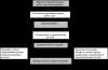
According to Wikipedia, merchandising (from the English "merchandis" - to promote in the market) is a part of the marketing process that determines the method of selling a product. The main task of merchandising is to give answers to the questions: where, when and at what price to sell a certain type of product. The first foundations of this science were developed by such large corporations as Coca-Cola, Pepsi and Philip Maurice. Merchandising is as important as having corporate identity or advertising campaigns. He is able to catch the consumer by the hand where the product has the last chance to be sold - at the point of sale, to show the product, to persuade him to choose this particular product among competing ones, to force him to buy a larger volume of goods.
Currently, merchandising is more applicable to large free retailers - suprmarkets and hypermarkets. However, the procedure, for example, of a shelf display of goods, would not hurt to know the owners of small standard trade stores.
Competent merchandising can help the sales agent to expand sales of the supplied goods, and the store management - to multiply profits. In a word, it promotes the establishment of mutually beneficial relations between suppliers of goods and their distributors.
What directions does this science include? Here are just the main ones:
1. Placement of commercial equipment (stands, racks, shelves, displays) on the trading floor;
2. Placement of goods on commercial equipment;
4. Training of sales consultants to promote each group of goods;
5. Ensuring an optimal stock of products in the warehouse, convenient storage of it near the points of sale;
6. Organization of an environment on the trading floor that stimulates sales through lighting, musical accompaniment, and smells.
Let's consider some points in more detail. So where to start? If you are in charge of a large hypermarket, to organize its internal space, it is best to contact merchandising specialists, that is, merchandisers.
“A qualified merchandising specialist is not at all someone who runs around the store back and forth, placing all the goods on the shelves indicated to him! He is a master of his craft, a manipulator of human consciousness, creating the so-called "purchasing impulses", forcing people to buy things that are completely unnecessary to them, at first glance, things.
Alina Korovkina, almanac "Laboratory of advertising, marketing and public relations"
Representatives of individual brands can wage marketing wars in the spaces of your hypermarket, and only a competent specialist can stop them so that everyone wins.
If your object is small shop and you are confident in your own abilities, you can take up the organization of the display of goods in the store yourself.
“The first mistake is to thoughtlessly contact the equipment seller and ask for an equipment layout plan. Of course, there are also equipment sellers good options arrangements. But this is rather an exception to the rule, believe our experience in creating planning solutions. You should always remember that you and your equipment supplier have different goals. He has to sell more equipment, you have to earn more per square meter of the store.”
Ekaterina Bogacheva
In addition to these recommendations, there are many more things that you should be aware of. First, this is the rule of the golden triangle. Its vertices should be the entrance, the cash desk and the main product, to which, for example, in grocery store includes meat, milk and bread.
The area of the golden triangle is the most passable place in the store. Therefore, there should be a product that needs to be sold quickly - perishable, expensive or new.
The next point: experts say that almost 90% of buyers pass only 1/3 of the store area and exit. Therefore, all basic goods should be visible from the entrance.
The strengths of the store, where products are sold more actively than others, also include:
- Shelves located around the perimeter of the trading floor,
- Shelves on the right side in the direction of customer movement,
- Crossing rows of shelves in the store,
- Places with good frontal visibility,
- Space near the cash register,
- End departments of racks.
The research of merchandisers in the field of so-called related products is also of interest. They say that some products are most often sold in conjunction with others. These groups of goods they called cross. Therefore, they should be located on adjacent racks. For example, shelves with salted crackers, chips and dried fish should be located next to the refrigerator with beer. And above the refrigerated bath with dumplings and dumplings, it is best to place shelves with mayonnaise and ketchup. Dry breakfasts generally become a dead commodity if they are not placed next to dairy products. Because with these main products, it is these additional ones that are most often bought.
You don't have to be a great analyst to understand this, but not everyone understands such subtleties as the arrangement of expensive sweets in holiday boxes next to alcohol. Usually these sweets are placed in the confectionery group. This is completely wrong - an ordinary housewife who is a regular visitor to the confectionery department does not need candies in boxes. They are bought as a gift, in addition to wine and cognac. Thus, all tradable staples should be mixed with related products, racks of staples should not be allowed next to each other, this is a waste of profit. And yet, mix the data of the product groups so that along the path of the buyer, he first finds the main product, and only then - the accompanying one.
“Along with a comprehensive assessment, at the point of sale, the merchandiser analyzes the return per meter of shelf space for each product group. Such an analysis allows you to decide which product groups to expand, which to narrow. In most cases, after the work done, the increase in sales volumes can be from 30 to 70%.
Natalia Guzelevich,marketing and merchandising trainer
Now let's go directly to the shelf space. So, coming to the store, the consumer examines the shelves in the same way as reading a newspaper. That is: first draws attention to the upper right corner, then from left to right, from top to bottom, continues to “read” the shelves. Based on this principle, the lower shelves are considered the most popular goods.
But! There are groups of goods that, whatever one may say, will always be located on the lower shelves. These are oversized or too heavy items. As for the upper shelves, the most expensive, elite goods are usually located here. So that, as they say, it attracts attention and does not interfere in the group of the most popular goods located on the middle shelves. They are at the level of the eyes and hands of the buyer.
It is worth remembering the “two fingers” rule, according to which the space between the product and the shelf above it should be an average of 3-5 centimeters. The presence of more space leads to the fact that the store seems empty, less - makes it difficult to choose goods. It seems that the goods are piled high. By filling in the gaps by adding new shelves, you can achieve a 30% increase in sales of products, for example, a non-food group (for example, cosmetics).
Now let's move on specifically to the methods of arranging commercial equipment. There are only a few of them:
1. "Rake". This method allows you to maximize the use of retail space.
2. Grid. This arrangement is typical for large stores.
3. "Diagonal" - a modified "grid". Uneconomical use of space, but an elegant arrangement of goods that may interest the buyer.
4. "Freestyle" - a chaotic style of the arrangement of commercial equipment, often used in rooms with a complex design, in which, as well as with "dioganal", most of the retail space is lost.
How to arrange the product on the shelf is also important. There is a horizontal, vertical and display display of goods. When laying out horizontally, goods of the same series are usually placed from left to right in decreasing volume. It must be remembered that the goods must be placed at the edge of the shelf in a straight line. With a vertical display, the goods are placed from top to bottom on all shelves from smallest to largest volume. Often merchandisers use a mixture of these two styles. It is important to consider the buying logic here. For example, when buying juices, the brand and volume of packaging are selected first, then the taste. It is logical that the layout should be done vertically - by brands, horizontally by packages, and within horizontal groups - by tastes.
Display layout implies the location of goods on separate structures.
Pay attention to the color of the product. It is convenient to place single-color blocks within one type of product. Another important rule of merchandising says - place brands in proportion to the profit they bring. That is, the most profitable products within the same group should be placed first.
Having placed the goods on the shelves, carefully reread the price tags so that such absurdities do not suddenly appear:
- disturbing chocolate mass,
- a variety of ice cream "KREMLIN-BRULE",
- sweets "COCK GOLDEN SINNER",
- SALAK drunk salting.
Do not forget to constantly inform the buyer about new products, for example, with the help of promotional products (POS materials).
Not a small role in the promotion of goods belongs to sales assistants. From how much they are aware of each type of product, it also largely depends on what type of product the consumer will prefer and whether he will purchase it at all.
In conclusion, I would like to say a few words about the smells and lighting of the store. To attract buyers, you can use, for example, seasonal smells (winter freshness or spring flowers) or dedicated to certain holidays (Christmas tree and vanilla smell on New Year's Eve). Do not overdo it in lighting - bright lighting will discourage the buyer, insufficient lighting will not attract him at all.
Properly using all of the above recommendations, you can record-breaking increase in sales. Keep this in mind the next time you encounter a lack of customer demand for product groups located in the corner of your store.
You will also be interested in:

But, given the point of view of the Russian Ministry of Finance, it is safer to follow its explanations. Otherwise don't...

- Good afternoon! Your payment came up today, but we did not see the money. - So what?! Today...
One of the basic concepts used in economics and business is revenue. It is with the data...
INTRODUCTION The relevance of the chosen topic is due to the fact that among the important development factors ...

It is explained like this. An employee can be sent on a business trip for any period, including ...

